The Ebola virus has devastated communities in large parts of West African and generate significant fear across the World. The unprecedented spread of the pandemic and the insurmountable challenge of containing such a virus in the interconnected globalized world we live in, has been a huge undertaking for support teams around the World. When facing humanitarian disasters of this magnitude, interactive world maps can provide important tools on which to base efforts, plan strategies and predict vulnerability for contagion.
A view of Interactive World Maps at work:
Many of the world mapping tools published in recent months on the topic of Ebola focused on transmitting information to users around the world. The visual aspects of a map and the important georeferences it provides, can reinforce efforts to galvanizing attention around an important cause. In many of the world maps found on the web, countries are assigned a color code or icon based on the human casualties and community impact the virus. Some of the maps are strictly visualization tools, while others are intended to be used as a source to assist relief efforts on the ground.
The Economist – a dynamic world map:
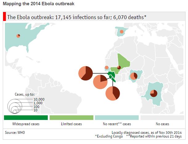 The Economist created an interactive world map titled “The journey of a virus” which highlights all Countries in which cases have been reported for Ebola. Based on the human impact the virus has had in each area, a dynamic icon containing several layers of information is displayed. The first layer is the overall impact projected according to a size scale of the pie chart with increments ranging from 10-10,000 cases. The second piece of information offered in this map is a percentage calculation of the infections versus the deaths caused by the outbreak. The comparison of this multi-tiered icon is quite interesting as it details the impact visually by contagion and human casualties in each Country.
Direct Relief – non-profit relief map:
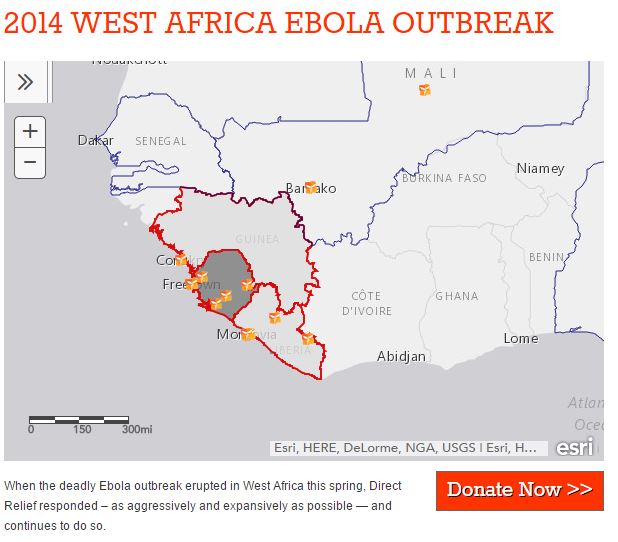 Direct Relief is a non-profit humanitarian organization that provides medical aid to face international disasters. They work with many disaster relief programs around the world and numerous maps are available through their. Specifically looking at the Ebola virus, the online interactive world map Direct Relief deployed was based on ESRI cartography and OpenStreetMap, with the ability to plot icons representing different categories of relief centers in West Africa. Each icon is linked to a pop-up box with specific information about the center, including the beds available and patients assisted. If a Country is selected instead of an icon, the map displays a pop-up box with statistics such as the total number of cases and case mortality rate.
Center for Disease Control – dynamic map with statistics:
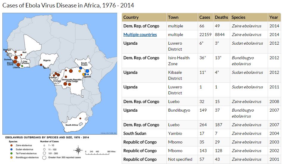 The center for disease control (CDC) also includes an online interactive world map with specific details about the 2014 Ebola outbreak. While the map in this case uses a static image with overlays, the page makes use of a detailed chart alongside the cartography in which additional fields are populated for each location. This information includes the strands of the virus found in each city and country along with a breakdown of the cases for each area and the year in which they were detected. Combining historical data on a map can also be helpful for illustrating how a virus spreads over time and possibly drawing predictions for its course in the future. These types of maps can be created with a time lapse to update on a timescale.
National Geospatial Intelligence – Maps to assist relief efforts:
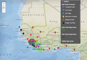 The last case we would like to mention for this article is the initiative made by the National Geospatial Intelligence Agency to publish many of their maps, for free for use by relief personnel combating the virus in West Africa. “To help combat the spread of the Ebola virus disease, the National Geospatial-Intelligence Agency is providing unprecedented online access to its unclassified geospatial intelligence products to lead federal agencies and their partners.” NGA created an overview map with links to easily access their mapping products by location. This intuitive and highly visual tool is extremely helpful to downloading material that may help personnel in the field analyze and design strategies for thwarting the spread of Ebola.
The resources offered in NGA’s maps are widespread and very extensive. Some of the maps that we reviewed included detailed layouts of watershed regions, ports of entry, and season charts. This information, pared with on-the-ground resources, can provide powerful results to planners designing strategies for combating the virus. Just imagine how monitoring season temperature, locating access to water and connecting transportation are crucial pillars to any relief effort. We commend NGA for making these important resources public and extend our full support and gratitude to of the ongoing relief efforts working diligently to combat the Ebola outbreak in West Africa.
Share the post "Interactive World Maps Used in the Fight Against Ebola"