At jQueryMaps we have been creating custom professional mapping solutions since 2004. With the advent of responsive websites and the priority given to mobile content, we have developed a series of interesting features that make our HTML5 maps more intuitive and simple to use on all mobile devices, including phones, tablets and readers.
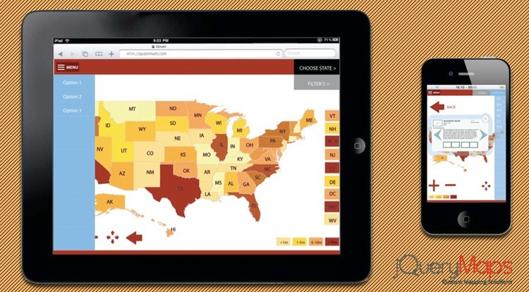
The latest version of our software includes a feature that automatically resizes any map according to the screen dimensions of the device being used. This is crucial to successfully using our products within responsive websites. The new maps do not have a fixed height and width, rather are designed to occupy a percentage of the available screen space. An important addition is that the layout quickly shifts between horizontal and vertical views to further maximize the display. This last point is especially helpful when navigating in wider cartography regions such as North America or Europe. 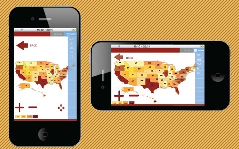
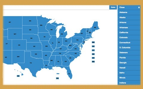
Our products have become so popular in part because of their ability to support custom features. Custom filters are often personalized to match the type of data, industry and requirements of a client. As part of our software transition to a mobile platform, we can now integrate a number of filters using jQuery Panels. The panels offer a great way to integrate the swipe feature of mobile devices and maximize filter size within the screen. Most panels are positioned to the left or right of the screen and push the page to display the panel filters until a selection has been made. This tool is a great way for users to quickly navigate to an area or to select the type of data to display on the map. Take a look at an example of a responsive map created with right panel filters: DEMO
Another important enhancement of the software is the dynamic re-sizing of the navigation buttons to accommodate smaller mobile screens. The zoom-in/out and back buttons automatically display more prominently on smaller screens for easier tap navigation. Along the same line, the State abbreviation boxes for the small eastern seaboard States can also be scaled so that a quick selection from the national level is possible. Contact us for any questions on upgrading your existing map or how these features can be implemented with your next mapping project.
Share the post "HTML5 Maps for Responsive Websites and Mobile Devices"