
Whenever data is being stored with an association to a geographic area, there is a long list of advantages to using maps as opposed to traditional spreadsheets. Not only is the visual result more appealing, but the impact of the tendencies in the data is much more pronounced. In this article jQueryMaps outlines some of the advantages to using Statistical Heat-Maps to visualize data, both internally and on a server.
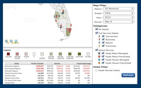
Perhaps the most compelling reason is the default ability to filter the data by geographic area. For long reports this is especially important, as lengthy lists are much harder to process than a DynamicMap that filters the information by simply clicking on a Country or State. Instead of applying a filter and refreshing the data in a spreadsheet, a one-click solution would provide the same result on the Statistical Heat-Map, where the information is color coded by areas and also displayed in an organized result table. 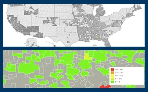
A quick glimpse at a Statistical Heat-Map paints an immediate image of how the data is organized. For example, a company tracking product revenues across an international market can quickly face challenges understanding the information across spreadsheets. On a dynamic map, sales can be organized and displayed by city, county or zip code in real-time. The software would automatically tally the information color coding the map on all levels of the cartography. Just a quick look at the map can give you a clear sense of how the data is evolving and more elaborate details would be shown in the results tables and pop-up boxes tools.
When working with filters, any of the queries used in a spreadsheet, can be applied to a Statistical Heat-Maps to only display a reduced data-set. The advantage is that the results are then displayed both in result tables and geographically on the map. Filters can be fairly general reducing the information by region or date. However, for more advanced searches, projects can also include filters by product type, type of sale, specific clients or by profit range.
When managing large data that is tied to a geographic location, the advantages of using a Statistical Heat-Maps outweigh any traditional spreadsheet. Users can quickly understand developments in the data by simply glancing at a heat-map, however more advanced filters can be applied for in-depth review of the information. Combining location data with a system of filters and results tables in a statistical heat-map can provide insights for any industry.
Share the post "Statistical Heat-Maps vs Spreadhseets for Presenting Data"


One thought on “Statistical Heat-Maps vs Spreadhseets for Presenting Data”