Questions abound regarding the rationale behind opening schools in the United States and as with most high-level decisions in 2020, the topic has become profoundly politicized. Part of the challenge surrounding the COVID-19 pandemic is the balance of prioritizing public safety while promoting economic prosperity. These two elements are often juxtaposed with one another and a medium ground is questioned by individual interests. It is hard for the economy to thrive if society is closed and it is hard to keep people safe if society is open. In this blog article, we will take a look at ways in which dynamic maps can be introduced in the discussion and what role technology can play in making informed policy decisions related to education in the US.
In this article we will look at the following topics:
-
Examining National Data Trends with US Maps
-
Creating Custom Campus maps and Monitoring Movement around a Facility
Dynamic Maps Showing National Data
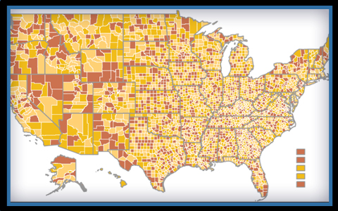
 A byproduct of improved testing procedures for COVID-19 has been an increase in the statistical data available which represents the true situation of the pandemic at the ground level. By shortening the gap in time between when a test is administered and when results are received, the accuracy of the data increases, and more safety measures can be implemented. This statistical data can be presented in a tabular form or for more effective visual interpretation, the information can be integrated with a dynamic map. Any such product can have varying levels of detail offering users the ability to see aggregate values in the initial view while having the capability to drill down on the map to view more specific information. This would also work to include anonymous individual test results within larger area-based data. This would work by first establishing the smallest administrative divisions used in the maps. These can be zip code divisions, townships, or school districts within towns. jQueryMaps can use an in-house system to associate each data point, identifying positive test results, to each specific division. This step is particularly useful if the data only contains partial information, such as the zip code or coordinates of the test site without specifying the administrative level to which it pertains. With this component established, maps can navigate from the top level to the individual clusters plotted at the lowest administrative view.
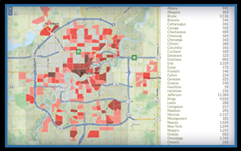
 When applying the data to schools, the project can define the locations of all buildings at the school district administrative level, showing this area and all adjacent areas color-coded based on the intensity of the test results. These color ranges can be adjusted in the map admin, but serve to give the user a quick glimpse of the situation on the ground in the vicinity of each school. The data can be further filtered using a map interface and the results automatically refresh in the project. At the district level, relevant information such as roadways and landmarks that define boundaries between districts should be included in the project. This can be achieved by integrating Google Maps or Open Street Maps as a background at the lowest level. These types of highly personalized maps combine small neighborhood school district divisions with larger national data and users can navigate anywhere within the project, drilling into greater detail to see specific results in the vicinity of their schools. Color shading of districts displays the assigned color category based on the number of positive test results. More specific figures can also be added in pop-up boxes with content specific to the school district or buildings plotted on the map. Data would be store on a server and updated automatically so results can refresh with high-frequency. This product would serve the community in general in addition to health professionals making educated policy decisions.
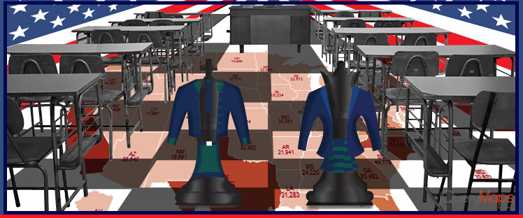
Building Interactive Campus Maps
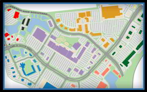 University campuses may already benefit from the implementation of dynamic maps, commonly used to identify specific buildings and locate important places around campus. These maps can be expanded to include features that may assist in contact tracing if any positive COVID-19 cases are discovered at the school. The first step would be to associate the movement of students and faculty to specific regions of the campus. There are many advanced options for achieving this goal, through phone Apps that enable geotracking or external devices such as fitness watches that allow for a person’s movement to be stored. A more rudimentary option would also be to simply require all students and faculty to check in with an ID prior to accessing and leaving any campus building. This would still identify a person with a place and time. Regardless of the collection method, the information should be stored in a database that can be queried by school health personnel. Once a positive test result is detected, administrators can research the movement of the individual by querying what building the student entered and during what time period. As all other movement is also tracked, administrators would know when individuals were potentially in contact within interior spaces with a risk of transmission. Health professionals would benefit from this information to quickly contact all individuals through an effective method based on verifiable data. Taking this step further, dynamic maps adapted to show live geotracking information could also display the movement of people as heatmaps, color coding geographic spaces, both interior, and exterior, based on the density of pedestrian traffic.
  Filters can be implemented to show results for places where individuals stayed in fixed places for a specified increment of time, as opposed to transitional encounters, in order to unlock clues for making spaces safer. As all data would be stored in a database on a school’s server, the information could be played back at any moment as a method of analyzing historical data. These illustrative heatmaps can also be defined with specific criteria to only show instances where close interaction within interior spaces was most pronounced.
The ultimate goal is to use technology and available data to derive important conclusions about how the virus might be transmitted in our communities. Leveraging these tools, we hope to be able to anticipate problems and quickly address situations where an individual who tested positive might have been in proximity to one of their peers. Contact us for more information about any of our dynamic maps and how they can be used to display complex data.
Share the post "Using Dynamic Maps to Uncover Solutions for Schools During a Pandemic"