The impact of dynamic statistical maps is tremendous when coupled with the right data and necessary filters. Our jQueryMaps product is designed to be easily configurable so that any project can make use of dynamic color codes by data ranges and the option to display sophisticated calculations.
The case of re newable energy is an industry that serves as a good example since maps are often used to plan expansion and project investment. There currently is vast amount of data available that registers average wind speed, solar intensity and wave indexes in different regions of the Country. Each reading is usually linked to either an administrative area, such as a city or zip code, or most likely specifically positioned according to the latitude and longitude of the measurement. This information is easily organized in a database, which in turn can be connected with our jQueryMaps software. The maps provide the canvas on which the statistical data is painted, either by color coding administrative levels (such as States or Zip Codes) or through a GIS background image. Any project can then be personalized any to include a complex system of filters.
Single layers of data provide useful visual tools, but the real core of the product is when multiple data tables and map layers can be combined within the same view. For example, energy companies planning new wind farms would need the ability to analyze the combination of wind intensity crossed with land value to determine what areas of the Country offer the best investment opportunities. Weather patterns or other industry data can also be overlaid to help narrow the search. All of this information does not need to be shown in separate maps, but rather can be deployed within a single jQueryMaps solution that uses personalized data filters.
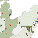
 When analyzing more granular information, such as specific measurement points, maps can use custom icons to define any finite location. Icons also offer powerful possibilities as they can be assigned different categories and controlled through a system of filters. For example a map with custom wind turbine icons can be shaded according to a range of production output. The result would plot icons dynamically based on database values and provide a glance view of each turbine status. The filters can work as toggle mechanisms so that only specific categories are shown or combinations of different ranges are created and plotted at the same time. This same concept can be taken a step further to also display active windmills separately from planned locations or even a company’s proprietary locations separately from competitors.
Joining industry specific data with the mapping experience of jQueryMaps can produce breakthrough products that change the way people view and manage complex data.
Share the post "Mapping Complex Industry Data with jQuery Interactive Maps"