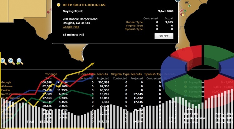
With the end of the fourth quarter insight we wanted to write an article focused on some of the ways our JavaScript Maps can be applied for ProfessionalBusinessAnalysis. A common request is the ability to monitoring company sales activity through a map interface and the ability to combining numerical tabular data with locations. This tool enables company decision-makers to view what sales are occurring in which areas, in order to draw better conclusions and plan for future strategies. The manner in which the data is displayed can be highly customized for each industry, but the final product holds important value across the board regardless of company size or sector.
When parsing high-volume sales data for a Company or industry, there are usually several variables that need to be considered in the calculations. In order to visually display the different variables at the same time, jQueryMaps has produced several helpful tools.
- Dynamic color coding of areas (including sub-regions) at a top level to provide important HeatMap statistical views. See example.
- Plotting of large numbers of icons to produce ClusterMaps to show specific points of activity.
- Multiple criteria can be shown at once by combining expanding icons, color coding of areas and patterns to produce multi-layered information in a single view. Imagine icons being scaled and displayed on the centroid of a State based on total employees, color coding of areas based on sales and patterns used to show expected growth categories. See example.
- Location comparison tools. It is possible to select multiple locations and run a cross-analysis to see how each location has performed on various counts.
- Dynamic HTML5 charts: charts can be included for individual locations within pop-up boxes or for any level view to depict the breakdown of information. In particular pie charts accompany multi level navigation well as they provide a breakdown of the percentages that relate to each view. See example.
- Extensive filters: custom filters to view the data from different perspectives. For example the map can have categories to color code and see totals by year, by product or by region in addition to any other variables that can be applied to the data.
In order to perform ProfessionalBusinessAnalysis to follow your company growth, consider creating a personalized tool using JavaScript Maps. We have witnessed the impact our solutions have had on defining company strategies and monitoring returns on investment. Let us know if you would like to discuss opportunities in a 30 minute commitment free consultation.
Share the post "JavaScript Maps for Professional Business and Sales Analysis"