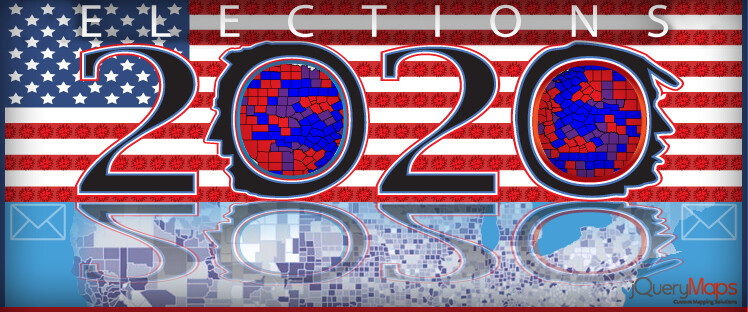
The United States is engaging in perhaps one of the most consequential elections of modern history, one which will mark the course of policy both nationally and internationally for years to come. Despite divisions within the nation and polarized views on a wide spectrum of issues, there is some consensus among the population on the importance of getting out the vote. The complexities involved in interpreting polling data and presenting results in real-time have been compounded by the restrictions imposed by the ongoing pandemic. Election maps will be featured throughout most media outlets as an effective method to interpret live election data for general viewers as well as more custom solutions to dichotomize results by geographic regions and specific data groups. This comes into play in the interpretation of the early voting results across particular segments of the population, which can serve as harbingers of tendencies within the overall vote. In particular, the results of the rural vote in certain Midwest states were determinant in the sway of the 2016 election. Some of these principles may hold true in the 2020 election and custom election maps play a useful role in extrapolating these cases from the live data feeds.
In this article we will look at the following topics:
-
Custom Election Maps to Analyze Data
-
Improved Experience through Custom UI
Custom Election Maps by Regions
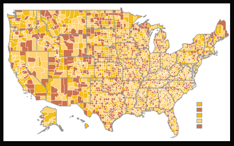 The most common illustration of election maps is a categorization of the electoral vote by State, visible at the national level. As the count of the total electoral vote is the determining factor in declaring which party wins an election, it is useful to display this data as the primary view of a project. However, multi-faceted designs provide better insight into the currents beneath the election results. One example is to pair the popular vote by County against the electoral vote by State to highlight the contrasts in geographic regions. The use of census data is also common to compare the results of election data with social metrics such as average age, household income, or levels of education. The underestimated importance of the rural vote was decisive in the 2016 elections and some patterns in early voting may hold similar insight into the outcome of the overall election. Multi-layered projects that provide users with the tools to interact with the data are particularly interesting as they allow for the incoming election information to be analyzed through different lenses. Another case that is being discussed exhaustively is the inclination of the Latino vote in the final tally of votes and how these numbers may vary from the 2016 election results.
 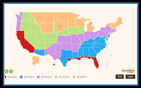 We know that the metric of a vote by a single cross-section of the population varies drastically from one region to another. For example, the concerns and overriding priorities of the Latino vote in South Florida are different from regions of Texas or Nevada. As such, an effective election map created with custom filters should enable users to drill down into specific regions to see poll results paired with census statistics. These key factors were pivotal in the previous presidential election and may prove substantial in the coming days.
Custom Interfaces and Filter Systems
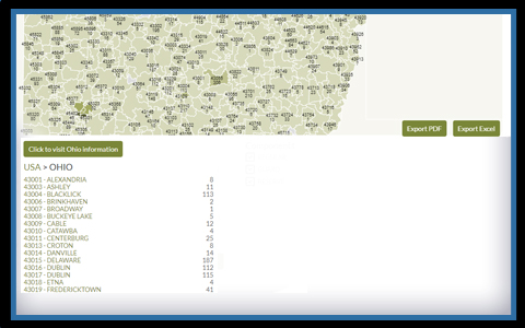 As discussed above, there is considerable value in building a custom project that includes a system of filters to interact with the election data and compare results through a historical lens and geographic regions. This interface should be intuitive to users, yet sophisticated enough to plot varying data sources within a single project. Filters can include tab buttons for the main categories, such as previous election results, ostensibly positioned above or below the map. Finer manipulation of the information for precise analysis can be built into dropdown filters and slide filters to offer subcategories of information. Perhaps one of the most powerful features of a custom map project is the activation of a results table that can be finely tailored to the focus of the project. Result tables list the information displayed on the election map in a traditional tabular format. The lists themselves can be filtered by order, exported, and printed for convenient presentation material, with the map view included above the lists. In advanced projects, designers can implement two results tables, on which fluctuates showing live results from the 2020 elections, with a second comparative list of the historical 2016 elections for any geographic region. As the map zooms in or new administrative divisions are displayed, the results tables would immediately shift accordingly. This system makes for a highly scalable and responsive tool that can generate impressive analysis content for presentations with only a few clicks of a mouse. In elections with live data feeds, this flexibility is crucial to passing along information swiftly to viewers.
We welcome your input or questions regarding our experience building custom election maps. Feel free to contact us at your convenience.
Share the post "Interpreting Live Election Data Using Custom Election Maps"