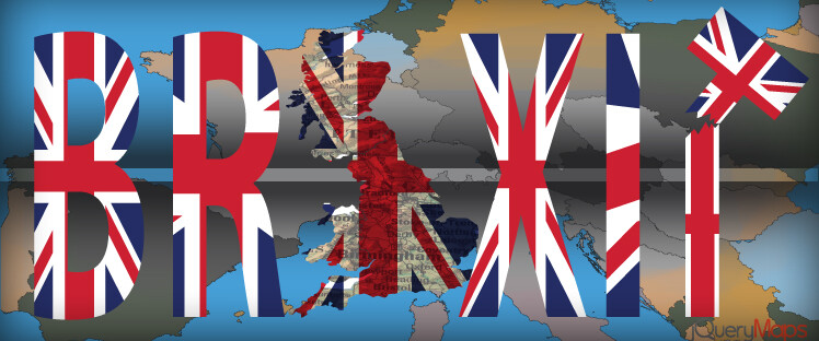
The European Union is at a crossroads and the course it charts for the UK will have vast consequences for the region with repercussions throughout the world. As global economies are tightly connected, the decisions made in one region impact countries around the world, in particular when new policies involve commerce. The imminent departure of the UK from the European Union, scheduled to take effect on December 31st, is particularly pronounced given the weight of the UK in terms of GDP within the Union and considering that London is one of the major financial hubs of the world. Early negotiations between the UK and the European Union were thorny but further hindered by the challenges presented by the COVID-19 pandemic. The foundation on which the early negotiations were based shifted during the outbreak and many of these talking points also needed to be readjusted. While 2020 and the aftermath in terms of human loss and economic retraction are complicated to calculate, tools to help predict the trajectories in social and economic terms can be helpful in making sound decisions. As the information serves to forecast the future, models need to be flexible to account for variations. Yet as integral as the data is to the model, it is also important to integrate tools to review and analyze the data. When looking at the myriad of factors that play into the UK’s departure from the E.U., interactive maps and dynamic charts assist in examining outcomes and presenting such information to the population as well as politicians handling the negotiation terms.
In this article we will look at the following topics:
-
Combining Economic Forecast Models with Interactive Maps
-
Dynamic Charts Combined with Presentation Tools
Using Big Data and Interactive Maps to Analyze Economic Models
 Diplomatic eyes keenly watch the evolution of the Brexit negotiations and how the terms will affect specific industries. The trade agreements under discussion are widespread and cover topics from agriculture, trade tariffs, free movement of people, and finance markets. These are not easy conversations with significant consequences for the region, yet it is imperative that agreements are met in order to avoid a no-deal Brexit scenario. Think tanks and economists crunch the data, looking at the statistics from a given sector and modify those numbers with new values presented in the trade negotiations. For example, if tariffs on imported cheese in dairy products currently stand at a percentage point, how will the industry respond if tariffs are increased slightly post Brexit? The current statistical information for any industry is vast and captures important features such as employment, revenue, and potential subsidiary industry impacts. Most of these statistics can be mapped to geographic regions. Specific sectors can be concentrated in one country over another and more specifically, the importance of a sector can be assigned to provinces within a country.
  One example would be manufacturing, which is an important contributor to Germany’s GDP, in particular in regions historically connected to the country’s long history as a high-end auto manufacturer. Changes in tariffs for manufactured goods between the EU and the UK would have a direct impact on these regions and the country as a whole. To what degree can the industry absorb an increased tariff and how will this affect profits for companies and their suppliers? Once the information is geocoded, interactive maps can be built with filters to engage users and create insightful visual tools for various scenarios. One example would be to present the impacts on employment that changes in tariffs would have throughout the European Union and within the UK. Thresholds can be established to color code areas based on the statistical values presented, which would change automatically as filters are applied. Any particular view of the map, whether zoomed into a country or a top-level of the region can be captured as a high-resolution graphic to later be brought into a PowerPoint presentation or applied elsewhere in the discussions. Impactful interactive maps provide tools to effectively interpret complex data through adjustable graphics. These solutions can help better understand and guide discussions for a smooth Brexit at the end of the month.
Integrating Dynamic Charts and Mapping Solutions
 When extracting conclusions and trends from large quantities of data, it is helpful to analyze the information from multiple perspectives. In aiding with this task, dynamic charts can populate from the same database sources driving the interactive maps. This provides users with multiple tools to examine the possible effects of Brexit on the UK and larger European economies. These graphic tools capture variations in the negotiations, which are brought into the models and displayed visually on both the map interface and accompanying dynamic charts. As tariffs are negotiated among the politicians, the economists will be looking at the impacts on industries at home, gauging the influence on employment, tax revenue, and many other factors. These factors can be captured geographically, shading provinces, and regions according to percentage values for each category. Furthermore, the same values can be used to generate a number of different charts such as pie, scatter, and column charts. Additionally, a tabular list with values is often displayed below the map, which can be manipulated through filters and exported as a PDF. A key feature of all of these tools is the ease with which the illustrations can be integrated into briefings and presentations. Since the mapping solutions and the dynamic charts are pulling information automatically from the same source, the information portrayed is updated the moment the values are refreshed within the database tables. The color shading and proportions of the charts adjust immediately to account for changes in the data values.
By leveraging technological tools such as interactive maps and dynamic charts with big industry data, politicians and economists are better able to analyze the effects of policy changes. Hopefully, these sources can guide negotiations in a positive direction to provide a smooth Brexit deal at the end of the year. Contact us with any questions on our mapping solutions.
Share the post "Tracking the Course of Brexit with Interactive Maps and Dynamic Charts"