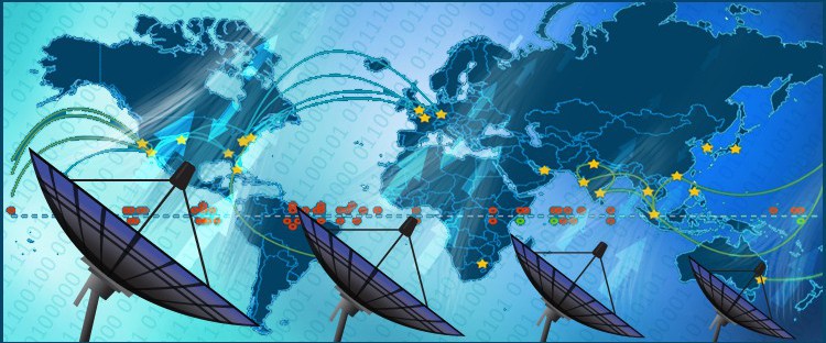
Satellites are the unseen generators that sustain our modern digital world. Key components of our defense strategy, global communications and real-time information rely on satellite connections and vast networks they provide as they orbit the earth. These networks underpin our society and have become an extension of our national borders, protected as carefully as any physical boundary. As the number of satellites grow and reliance on their services increases, tools may become necessary to presenting information regarding identifying scheduled maintenances, real-time coverage and confirmation of general status for each satellite. A World Map with Countries can serve as a visual portal to plot specific satellites on a map and provide detailed information for each location through a series of filters and pop-up boxes.
In this article we will discuss the following features:
Plotting Interactive Data on a World Map
Controlling the Level of Content Displayed on an Interactive Map
Tools for Improving the Visibility and Usability of any Country Map
Displaying Live Content on an Interactive World Map
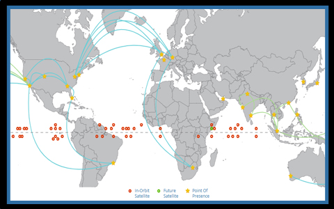 One of the key components of any serious mapping solution is the ability to connect with existing data and update information in real-time. This is achieved on a World map with Countries by calling the information through a series of scripting pages or using JSON data hosted on a company’s servers. Storing the information on the client end has numerous benefits, primary among which is security and full control of the data being projected on the map. This means that management can choose when to upload new information or selectively filter content independently from any third-party services. When the focus of the map is locations, information is geocoded on-the-fly to plot locations in their true geographic positions. In some instances, it is preferable to have icons displayed in a suggested location, such as on the equator or along the arctic circle, and this is achieved by setting the project to accommodate two types of locations. Any icon that is associated with an address or lat/lon is automatically shown on its true coordinates while orbiting vessels are assigned a category and positioned in a predetermined location, automatically spaced and rotated to allow for easy selection by users. For locations that share the same location, such as multiple offices or adjacent towers, icons can be grouped in a multi-POI which is assigned a distinct icon and can be selected to display a list of options within said location. All of this functionality is automated so administrators only need to add content to the map tables and the system positions the information according to the preferences requested when the tool is built.
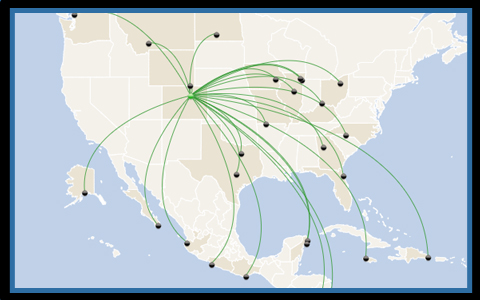
To enhance usability, many mapping projects come with a series of filters that can be personalized to your specific industry standards. A sample of filters includes search fields by location, by category along with a series of drop downs or toggle filters if the information displayed is fairly varied. See an example of a jQuery World map with connecting lines. Another key component is the ability to include connecting lines between locations that serve to show any number of features. In most projects, lines represent directional connections, such as server communications, but in the case of the travel industry, it can also be expanded to show flight traffic between airports on an interactive map. Curves can be adjusted to display both north to south or vice versa. The actual lines are dynamic features that can contain information displayed in both pop-ups and tooltip boxes. Certain projects also have implemented features where lines are given different weight according to the amount of information representing said connection. This is important for the communication industry where lines can represent bandwidth, real traffic between users or immediate status updates. Contact us to see more examples of projects that work with lines and real-time data.
How to Use Dynamic Web Maps with Secure Data
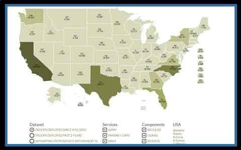
 The data displayed on any company map can be general or highly detailed for more substantial quantifying purposes. Accordingly, it is important to filter the content based on how the map is accessed and being used within the company. This task can be approached from several different angles. In almost all circumstances, web-based mapping solutions are designed to reside on the client’s servers, thereby extending the same security standards that cover the rest of the website to the map component. This is an important point to stress, as Companies need to know that their sensitive information resides behind their existing firewalls and other important security measures. To take from the example above, the World Map with Countries used for the satellite industry was created with two different views. The system recognizes whether viewers of the map are coming from within the Company intranet, in which case they are granted full access to the information, while outside users can only see partial details as specified by the client. See example of dynamic content displayed on World map.
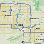
 Further access restrictions can also be included in the project. The initial page can include a password-protected login for all users or just for high-level access. This offers the possibility to include many additional features in the project with the assurance that only those members with specific credentials can view content on the map, including the possibility to edit the details of the locations and pop-up boxes from within the system. This last feature is an important addition to any mapping project as admin layers to edit content are common solutions to facilitate data entry through the map. Tools include the options to edit existing content, add new content, upload documents and images, reposition icons and much more. One additional component that can be included within the admin or accessed directly from the map, is the option to create customized reports for use in presentations. These documents can be highly personalized to report on different facets of the company’s activities and can be shared from within the map via email or posted predetermined intranet pages. An example of a report feature built into a custom web-based map can be seen in this details US Map example. The output of any report, whether in an Excel list format, pdf, jpeg or png file, can be immediately shared with other members of the company.
Mobile Content and User Friendly Custom Map Features
A key component to any interactive World Map with Countries is the ability to transmit content to viewers across any browser and device. Most HTML5 Maps are designed to be responsive and should work seamlessly within responsive web pages. This means that the content of the map and actual map dimensions are scaled to automatically match the screen size of the device being used. There are also other useful tools that can be added to a project to increase usability on smaller screens. The first item is to simplify navigation buttons and filters to use larger tabs which are easier to access on tablets and phones.
A popular request is to integrate jQuery panel filters with map projects as opposed to standard drop down boxes, especially for versions designed specifically for tablets and phones. These filters expand and shift the page to the left offering viewers a clear and easily selectable list from which to choose. Once a selection has been made the map centers on the point or area and the panels collapse to the right of the page. These types of filters can also include several hierarchies in the event sub-filters need to be embedded in the map. See an example of a custom web map designed with jQuery panels and collapsable headers within pop-up boxes as shown here. 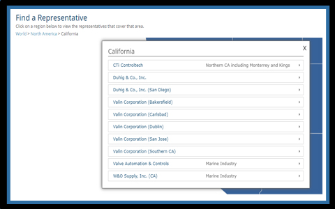
There are numerous ways World Maps with Countries can be integrated with real-time data to provide a powerful analytical tool for companies. In this article we looked at a project designed for the satellite industry, reviewing the ways the tool was tailored to meet the company’s specific needs, including distinguishing between orbiting satellites and land-based locations and integration of dynamic connecting lines to show information between points. The best method to learn more about the potential of HTML5 mapping software is to schedule a phone consultation with our team http://www.jquerymaps.com/company/get-free-30-minute-consultation/ We look forward to hearing from you soon.
Share the post "Satellite Industry Connects with jQuery World Map with Countries"